How to design mobile friendly e-mail marketing
With over 88% of mobile phone users now checking their e-mail regularly on a mobile device e-mail marketers need to catch up and consider that each e-mail they send out does have enormous potential to be viewed on a mobile platform. Mobile content and optimization is one of the main ways that marketers can update their tactics and reach a wider audience. Mobile devices make us more reachable and also allow for more urgency in e-mail marketing and online promotions. Because we are able to check your e-mail multiple times through the day retailers can design mobile friendly content and can see you better open rates and conversion because their content can be accessed from anywhere.
Here are some tips on how you can work at designing more mobile friendly e-mail marketing content.
1. Create a link to mobile versions of the same content: something as simple as generating two templates for an e-mail could be all that’s needed for a mobile user to easily access and read your content. Placing a link at the top of your e-mail to a mobile friendly version of the e-mail will ensure that all of the content can display correctly across multiple mobile devices and that your recipients are viewing the content you created as you intended.
2. Keep your content concise: in a mobile browser your content needs to be easily scannable and fonts will need to be larger in order for them to show up on a mobile screen. Keeping your points easy to read and your paragraph small will make sure that your message comes through even on a mobile device. Make sure to use at least a 13 point font and larger sizes for your headings or your e-mail might be unreadable on many mobile devices.
3. Try to keep links separated: when you put links close together it can be really hard to navigate through a mobile e-mail. If a user continues to click the same link or clicks the wrong link they may get frustrated with your e-mail or find it impossible to read. Make sure to keep links separated from the body text and never put links directly next to each other.
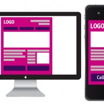
4. Keep your e-mail to one column design: many e-mail marketers use two or three columns for PC-based e-mail marketing. While these layouts can look very professional and they can be extremely difficult to read on a mobile platform. Make sure to keep your e-mails to one column design for the mobile platform.
5. Optimize your website for mobile devices: you may want use a professional to optimize your website for multiple mobile devices or make sure that your website has been tested across multiple mobile devices as well. Ultimately with e-mail marketing you need to make sure that customers can follow your links through an access your sales page. Well your e-mail marketing may be mobile friendly, this marketing will be useless unless your sales page is mobile friendly too.
Print This PostRelated Articles
By: Sarah Marshall
Sarah is the Social Media Manager at MonsterMail. You can follow her on twitter - @RealMonsterMail


adwwwwwwwwwwwwwwwwwwwwwwwwwwwwww
waddawddawawaddad
waawdwddaawd
hello!